Wednesday, 26 September 2012

Case Study #3

Metastadt, built in the city if Wulfren - Germany in 1974 and designed by architects, van den Broek and Bakema is an excellent early example of the flexible, modular design I feel is integral to include in my Learning Centre for Project 2.
I believe modular design is the best means of providing adaptable spaces that can be retro-fitted, re-purposed, maintained and deconstructed with the greatest ease, which are issues that need to come to the fore-front when designing for sustainability.

“The Metastadt building system was supposed to provide a concept for a flexible model of urbanism. A pilot scheme supported by the Federal Government, the system behind the Metastadt development is that of a space plan that is supposed to be capable of unlimited horizontal and vertical growth. The space frame structure itself is bolted to allow easy assembly and disassembly which allows for everything to remain changeable and adaptable. The infill system is separate from structural system: the office spaces have demountable walls whilst partition walls in apartments are made of plasterboard. One further aspect that contributes to the system's flexibility is the servicing system, which is accommodated in raised floors with a clearance of 0.45m.”

Although the building was demolished in the early 1980s due to technical faults caused by cost-cutting measures, the underlying concept of a ‘flexible model of urbanism’ acieved through modular, flexible design is still utilised today in many effective and still-standing forms.

The website titled Flexible Housing http://www.afewthoughts.co.uk/flexiblehousing/timeline.php is an excellent place to browse these projects in an easy to read Timeline format. The projects that have really resonated with me and will in some way inform my architectural entity’s form, function and aesthetic can be seen below.

Domino 21.

Gewild Wohnen

Quartier Saint-Christophe

Soft House
Other examples of modular and even capsule design can be seen below and offer even more food for thought.
 The fundamental concepts of this case study will now be applied to Prototype #3, and may in turn inform the final outcome of my design.
Image References: 

Project Two (Step Four): Space Planning

Generated from the 'Brainstorming of Issues' exercise conducted earlier, the following is a preliminary list of spaces for inclusion to inform the design of my architectural entity:
  • Storage
  • First Aid Room
  • Plant Room
  • Indoor and Outdoor Market Spaces
  • Parking
  • Computer Lab
  • Gym
  • Kitchen
  • Workshop
  • Consulting Rooms
  • Atriums
  • Transport Hub
  • Toilets and Showers
  • Library
  • Event Spaces
  • Flexible Rooms
  • Food and Drink Amenities
  • Lifts, Stairs and Escalators
  • Greenspace
  • Childcare
This list may be added to or subtracted from, however it provides a basis for the progression of my design.

Rapid Prototyping (Case Study #2)

The following prototype has been informed by the concept of experiences and relationships being formed through the interaction of levels as portrayed in M.C. Escher's works. By focussing on just the actual level planes I will be using at the Paddington Central site, and creating multiple areas of vertical and horizontal circulation, I have tried to imitate the interaction 'hot-spots' seen in Escher's work. I have negated the use of actual staircases to highlight the level changes and access points within the Centre.
As can be seen below, the addition of an entry point to the site from lower Morris Street allows for a longitudinal flow of circulation through the entire length of the site. Coupled with multiple access points dissecting this axis from Warmington to Morris St at various locations across the site, a porous and pedestrian friendly entity can result.
The implementation of atrium spaces as proposed in Case Study and Prototype #1 has been included in this prototype. These atrium spaces aid in opening up the centre and provide an excellent means of generating spaces that connect effeciently as a whole. I have never used this method of space planning before, however I think it allows for a more wholistic approach to designing such a complex architectural entity.
 The above images best convey the similarities to M.C. Escher's work. The exclusion of Impossible Figures makes this a viable, working space, however I have exagerated the amount and location of these circulation points to highlight the concept proposed in Case Study #2 from Escher's work.
Although this has been an effective means of beginning to develop floor plans and sections and to begin space planning, I think more refinement is absolutely necessary. I do believe however that the level planes in general will continue to show up in further design development stages, and the carpark (GL), level 1 and level 2 will remain as they are. Only levels 3 and 4 may need revising.

Thursday, 20 September 2012

The In-Between Spaces: Examples

I have made mention in a few of my Blogs to the creation of 'in-between spaces' in my design, and the importance of these 'in-between spaces' to the activation of space in general and the site as a whole. I have found an excellent book in the library titled: Dazwischen/in between that has beautiful images that convey what I mean by the term 'in-between space'. The following introduction from the book gives an overall idea of the importance of these spaces to the vitality and liveability of urban areas which if of great relevance to Paddington as a suburban centre and future urban node.

"As built-up areas merge increasingly into one another at regional level, the landscape becomes urbanised and the traditional dividing line between urban and rural space is blurred. Rampant suburbanisation at the periphery of big cities turns the surrounding landscape into something that can neither be called clearly urban nor clearly rural. The resulting longing for an original rural environment is shown in the following images that represent moments of urban life isolated from a reality that finds itself in a state of constant and ever- accelerating change. These moments take place in the 'in-between spaces'".


Reference: Architekturbild. (2011). Dazwischen/in between: European Architectural Photography Prize 2011. Published by Die Deutsche Bibliothek. Ludwigsburg, Germany.

Case Study #2

When I stand on the bottom level of the atrium space inside Paddington Central Shopping Centre, and look back at the escaltors, stairs and vertical connections inherent to the space, I am reminded of M.C. Escher's work titled 'Relativity' (1953). It is the connection of levels and vertical and horizontal relationships portrayed in Escher's works that I think are integral to emmulate in my design for Project Two.

Relativity - Waterfall - Convex and Concave
I think it would be an excellent physical manifestation of the interaction between different and all age groups that I am proposing takes place in the cross-generational learning centre, as well as the various and highly important levels of learning one undergoes and experiences throughout their whole life.

M.C. Escher is widely known for his graphic works conveying impossible realities. People ascending and descending stairs in an infinite loop and constructions that are impossible to build and are ony possible to draw through the manipulation of perspective and perception. It is these constructions that I am focussing on in this case study, as although they are impossible to build as they use Impossible Figures (IF) such as Necker Cubes and Tribars - the vertical and horizontal relationships generated through circulatory paths, stairs and entryways are of particular importance to my design.

Impossible Figures - Tribar - Necker Cube
Although Escher's works can be confusing, if the underlying essence of interaction on all  levels is extracted, they become very valuable for informing and application into built forms.

Image Reference: http://en.wikipedia.org/wiki/File:Escher%27s_Relativity.jpg

Sunday, 16 September 2012

Project Two (Step Three): Distillation of Issues for Space Planning

The following table is a result of the Key Issues that were highlighted in the previous exercise of brainstorming. Three main issues occurred across all age groups being:

  • stimulation
  • interaction
  • learning
The issue of 'learning' encompasses all forms of traditional education, social learning, skills learning and learning from elders (respect and manners) as well as the flip-side being 'teaching'. It is envisioned that knowledge shall be passed in a cyclical fashion throughout all age groups.

The issue of 'guidance' pertains to both the need for and giving of guidance. For example, a member of the 'Tertiary age group' could seek guidance from the 'Adult of Elderly age groups' or vice versa. Once again there is a cyclical, wholistic transfer and sharing of knowledge needed.


The issues not highlighted in blue are still vital to the development of individuals and will also be included in further stages. I believe this was a very effective means of identifying key areas for Space Planning purposes.


Project Two (Step Two): Brainstorming of Issues

Using the User and Mood Boards to gain an understanding of the users of the site and their daily lives, issues regarding their physical, emotional, pyschological, social and educational development were brainstormed. These issues were subsequently distilled to attain the crucial and overlapping key points for each age group as can be seen below.

 The next step to be taken from this exercise is to distill these Key Points further to identify ones that run across the entire age spectrum and will thus be of the most importance when Space Planning. A heirarchy of issues will result which will then translate into spatial experiences and built form.


Project Two (Step One): Identification of Users

An effective method utilised by Industrial designers when wanting to attain a deeper understanding of who one is designing for is through the creation of thorough and in-depth User and Mood Boards. This method can easily be transferred to the architectural design realm, and is one I have utilised to better understand the Users of my site, and will in turn be used to inform the next phase of the project: Space Panning.

The User Board is used to show the demographic/s of who one is possibly designing for. The User Board below is based on the demographics inherent to Paddington and surrounding suburbs, and are of particular interest with regard to my intent to design a cross-generational learning centre.
 The Mood Board aims to show how this User/s conducts their daily life/lives. One aims to answer questions such as:

  • What do they like?
  • What do they like to do?
  • What and how do they eat?
  • How do they learn?
  • How do they exercise?
  • What and how do they work?

These exercises have been a highly beneficial starting point for the subsequent stages of the design process. These boards will be used for brainstorming on the life, growth and development issues relevant to each age group, which will then be used for Space Planning purposes.

Thursday, 13 September 2012

Site Analysis

Existing Businesses and relationship to Residential areas

Business regions along Latrobe and Given Tce

Contrast of character regions (daylife vs nightlife-hatched)

Journey from Roma St Station to Paddington Central
Points represent Public Transport stops I used.

Site Opportunities


Yellow highlighted areas are to be re-purposed. Need confirmation from Tutor for sites (a) and (b).

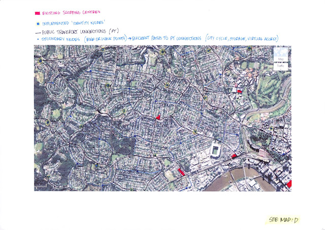
Connectivity framework required for 'Future Scenario' of few to no car use, and walkability of Suburbia.

Rapid Prototyping (Case Study #1)

Using the underlying ideology of porosity and the creation of 'in-between spaces' from the Re:START Pedestrian Mall in Case Study #1, the following massing diagrams aim to show how replicating the 'Active Atrium' existing in Paddington Central Shopping Centre can activate the whole of the shopping centre by becoming more pedestrian oriented and allowing for the creation of 'in-between spaces' for: greenspace, seating, landscaping, pop-up shops, entertainment, gatherings and meeting points.


As Woolworths will no longer be in the Centre, the space that it once occupied can now be accessed at Morris St end and dissected and better utilised. By implementing another lift, the Morris St end of Centre becomes more accessible and user friendly.


The addition of new entry points activates Morris St level, and the use of balcony and outdoor spaces activates whole facade. Can also be seen in diagrams belows for Warmington St level.

I found this exercise of rapid prototyping, coupled with my case studies quite beneficial in getting the ball rolling. In the past I haven't started working in 3D straight up due to my comfort in hand-drawing and lack of knowledge and skill with computer programs. This semester however, I'm not sure if its due to the enthusiasm of our Tutor or the fact that its our last Design subject, or perhaps that we have been able to write our own brief for this project, or the encouragement from our Lecturer to experiment, or a combination of all of these points, but I just feel more confident in experimenting and trying new things that I've never done previously. It will be interesting to see the result of these experiments and the final outcome, but I think I'm going to enjoy the journey anyhow.

Thursday, 6 September 2012

Case Study #1

I will be conducting a series of Case Studies to help both myself and those involved with my approach to Project 2 to; understand, test, experiment and support my design process and outcome. The first Case Study will look at the Re:START Mall designed by Anton tritt and the Buchan Group in the New Zealand town of Christchurch.

Re:START Mall Christchurch, New Zealand
In response to the series of major earthquakes that resulted in almost 800 buildings being demolished in Christchurch in Septmember of 2010, the Re:START Mall is situated amongst the remianing Victorian and Edwardian commercial buildings that once dominated the town centre. Comprised of brightly coloured, retro-fitted shipping containers, stacked and arranged in various configurations, the new and temporary pedestrian mall exhibits an array of high-end and boutique shops, cafes and restaurants, and is surrounded and permeated with ample seating, landscaping and amenities.

Pedestrian Oriented Mall Layout
It is the flexible potential of this approach to designing for 'Community' that is especially pertenent to my architectural intervention for Project 2. I not only love the aesthetic of the Re:START Mall, with its bright, cheerful palette and exposed structure (which gives a sense of stability and safety in the post-earthquake region), but also the 'in-between' spaces that are generated through this modular, ubiquitous design. There are both vertical, horizontal and diagonal (in 3 dimensions also) interaction opportunities for users which is achieved by the porosity and permeability of the spaces as a whole.

It is truly a space for People.

Image reference: http://aboutarchitecture.wordpress.com/2007/08/22/constant-and-vision-vs-reality/

Presentation Feedback

I would first like to start by expressing my approval of the layout of the exhibition spaces for our Project 1 presentations. The horizontal display of the panels was very effective as one could easily move along at their leisure. It was difficult however to actually present/talk to our Tutors in such a small space, but as we only has 2mins it was for only a brief period of time.

The majority of the feedback from our Tutors was very positive, with the only exception being that perhaps what we were saying wasn't being reflected in our panels (kind of major?), however we believed that once the Tutors sat down and looked closely and read the content, the message would then come across and reflect our underlying ideology and aim of our project and subsequent brief.

I found that the Urban theme groups all took similar approaches, in that the vast majority all proposed the 'taking back of the street for greenspace' idea. The majority of the Virtual theme group's prosposals went over my head as they 'wowed' me with awesome visuals to the extent that I lost the message and purpose along the way. I do however, look forward to seeing the results of this particular theme group as I feel that I lack the necessary skills to do this one. One could say that I aspire to be able to produce what these students do.

Presentation Spaces: Friday 31st August 2012

Saturday, 1 September 2012

A new take on traditional 'retail'

As proposed in my individual statement earlier, the issue of educational sustainablility and the subsequent architectural intervention for project 2 is not 'retail' in the traditional sense, but as there is an exchange of knowledge and I guess there is a 'selling' of experience, I believe this constitutes 'retail' in its rawest sense.

The Importance of Infrastructure to Sustainability

It can be said that: ‘Architecture is uniquely positioned to comment, advise and intervene in relation to questions about the role, form, aesthetic and provision of infrastructure. While architects are relatively powerless to provoke the changes necessary to generate renewed investment in infrastructure, they can begin to redirect their own imaginative and technical expertise towards the questions of infrastructure.’ (Tweeddale, 2012)
A definition of ‘infrastructure’ (in its rawest sense) can be found in Anna Tweeddale’s article: Infrastructure, Excess and Difference (2012) where she quotes the work of architect and theorist Stan Allen, who acknowledges that: ‘Infrastructural systems work like artificial ecologies in that they manage the flows of energy and resources on a site, and direct the density and distribution of a habitat. They create the conditions necessary to respond to incremental adjustments in resource availability, and modify the status of inhabitation in response to changing environmental conditions.’ (Tweeddale, 2012)
In contrast to this utopian definition of infrastructure, the heavily road-reliant plan prevalent nation-wide in Australia (and the US) represents ‘a US post-war urbanism, exported globally, that continues to promote the garden city and urban sprawl’ (Raggat, 2012). In Brisbane and greater Melbourne it has been used effectively to stimulate the economy at the expense however of turning productive farmland into unproductive suburbia, delaying the necessity of investing in public transport and spreading these cities ever thinner around the countryside.
There are moments where everyone can see that there is a paradigm shift needed with regard to the relationship of our natural and built environments. However, we are complacent and happy with the comfort level of certain things that we hope that the addition of more technology will solve these issues. Although this isn’t a method that can be applied to every urban situation, an example of the effective application of technology to provide a sustainable urban outcome can be found in South Korea’s capital Seoul and also its new city of New Songdo.
The article titled The Wired City by PD Smith in Architectural Review Magazine (August/September: issue 126) proposes that: ‘The world’s most wired and connected city is the South Korean capital of Seoul. Nearly every household in this modern high-rise city of 12 million people is linked to the cable network and can access the internet at a speedy 100 megabytes per second. The whole city has also been transformed into a wi-fi hotspot, thanks to an innovative wireless network that allows commuters on the subway to watch TV on their mobile phones. Those same commuters pay for their bus and taxi journeys with a radio frequency identification card.
Seoul is upgrading itself as an ‘open data city’ in a belief that an informed city is a more efficient city. Thanks to the ‘Ubiquitous Seoul’ (U-city) project, Seoul’s online citizens will be able to access real-time urban data from sensors around the city. New homes in Seoul are being designed with ‘Ubiquitous life’ (U-life) features, allowing them to be centrally controlled by a keypad or remotely with a smartphone.’ (Smith, 2012)
It can be seen from the above example that the effective overlay of an efficient virtual component is resulting in an informed, connected and sustainable city. The New Songdo project also aims to exhibit this same virtual component, however having been implemented at its inception and having had the luxury of being built from scratch, it can therefore more effectively accommodate this technological aspect.
Conversely, there is no reason for Australia or even Brisbane to build from the ‘ground-up’ like New Songdo is doing in this case. Not only is it unnecessary as we already have the framework in place that has the potential to sustainably support itself (it just hasn’t been realised yet), but because it would be a complete waste of little resources we have. By becoming less road-reliant and by living in more centralised, densified locations dispersed throughout SEQ, the implementation of a ‘Ubiquitous system’ as proposed by the Seoul project would not only hugely benefit the economy and socio-cultural urban fabric, but would also cease expansion into the natural environment. This would simultaneously ‘free up’ urban greenspace in the process and would result in the first steps being taken to the preservation and re-invigoration of the natural environment. This re-invigoration would in turn result in a socially, economically and environmentally sustainable community on a local, regional and national level.
References:
Tweeddale, A. (2012). Infrastructure, Excess and Difference. From Architectural Review Asia Pacific Magazine. Issue: 126 (August/September, 2012). Published by Niche Media Pty Ltd:Melbourne.
Raggat, M. (2012). Melbourne Gateway: Oblique Architecture. From Architectural Review Asia Pacific Magazine. Issue: 126 (August/September, 2012). Published by Niche Media Pty Ltd:Melbourne.
Smith, PD. (2012) The Wired City. From Architectural Review Asia Pacific Magazine. Issue: 126 (August/September, 2012). Published by Niche Media Pty Ltd:Melbourne.